Why Image Compression Matters
Images are the single largest contributor to page weight on most websites. An uncompressed hero image can easily exceed 5MB, while a well-optimized version might be under 200KB without any visible quality loss. This difference directly impacts your site’s loading speed, which affects both user experience and search engine rankings.
Google has confirmed that page speed is a ranking factor, and studies consistently show that users abandon sites that take more than three seconds to load. On mobile connections, where data is often metered, large images don’t just slow things down — they cost your visitors money. Compressing your images is one of the highest-impact, lowest-effort optimizations you can make.
Understanding Compression Types
Image compression falls into two categories: lossy and lossless.
Lossy compression permanently removes data that the human eye is less likely to notice. JPG and lossy WebP use this approach. The advantage is dramatically smaller files. The trade-off is that re-saving a lossy image multiple times compounds the quality degradation.
Lossless compression preserves every pixel perfectly. PNG, GIF, and lossless WebP use mathematical algorithms to pack the same data more efficiently. File size reductions are more modest, but quality remains identical to the original.
For photographs, lossy compression at 70-85% quality typically produces files that are indistinguishable from the original to most viewers. For screenshots and graphics with sharp edges, lossless PNG often produces better results.
Practical Compression Techniques
Start with the right dimensions. Serving a 4000x3000 pixel image that displays at 800x600 is wasteful. Resize images to match their display size before compressing.
Choose the correct format for the content type. Photos should almost always use JPG or WebP. Graphics with text, logos, or transparent backgrounds need PNG or WebP. GIF should be reserved for simple animations.
Use quality sliders effectively. Rather than accepting default settings, test your images at 60%, 70%, 80%, and 90% quality. View them at actual size and look for artifacts around edges and in gradient areas.
Recommended Settings by Use Case
| Use Case | Format | Quality | Notes |
|---|---|---|---|
| Photography | JPG or WebP | 70-85% | Balance quality and size |
| Screenshots | PNG or JPG | 80-90% | Text-heavy images need higher quality |
| Graphics with text | PNG | N/A | Lossless preserves sharp edges |
| Web images | WebP | 75-85% | Smallest files, modern browser support |
| Thumbnails | JPG or WebP | 60-75% | Small display size hides compression |
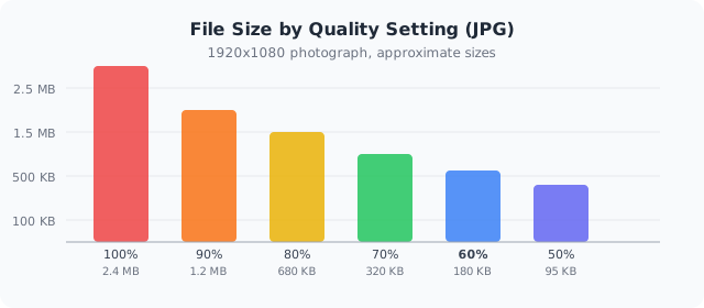 Typical JPG file sizes for a 1920x1080 photograph at different quality settings. Lower quality = smaller file.
Tools and Workflows
Browser-based tools like ours are perfect for quick, one-off compression tasks. Upload your images, adjust the quality slider, and download the results — all without installing software or sending files to a remote server.
For batch workflows, look for tools that support multiple file processing. If you’re working with a static site generator or framework, consider build-time optimization. Next.js Image, Gatsby’s image plugins, and Vite image optimization can handle compression automatically during your build process.
The key is making image optimization part of your regular workflow rather than an afterthought. Every image that goes live on your site should be appropriately sized, correctly formatted, and optimally compressed.